This is a crash course - it may take years to get "comfortable" with typography, but understanding the basics gets you 80% of the way there.
What's a font?
A set of letters, numbers, and other symbols that takes on a distinctive shape and style.
What's a typeface?
A set of fonts. For example, the fonts Palatino Regular, Palatino Bold, and Palatino Italic make up the Palatino typeface.
In practice, computers have helped blur the line between typefaces and fonts. For example, a computer operating system makes no distinction - there is a "fonts" folder and that's it.
What is a Pt?
A Pt. is a "point." This is a unit of measure that is equal to 1/72nd of an inch. A "pica" is the point's big brother - there are twelve points in a pica. So a pica is 1/6th of an inch.
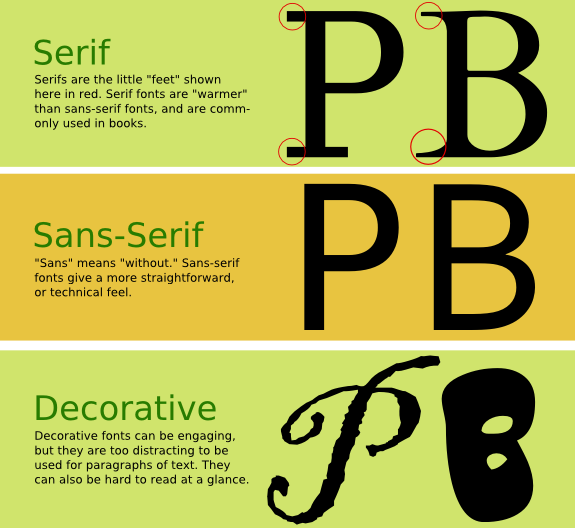
The three basic types of fonts: Serif, Sans-serif, and Decorative
A serif is a "foot" or an extra decorative element that extends from individual characters. Serif fonts give a more "comfortable" feel and are the type used most often for body text (text that's longer than one line) because they are more readable and pleasing to the eye. However, sans-serif fonts can be used for this purpose as well - although they tend to be used more for technical manuals and "less-warm" documents.
Be careful with decorative fonts - they are a loaded weapon! Don't use them for paragraphs of text - just for the main title of a document, for example.
Fonts also have variants, like bold, demi bold, condensed, black, italic, etc. - this is a "design helper" for you.
Beginning Guidelines
a. Insert only a single space after all punctuation. Using a double space (hitting the spacebar twice after typing a period, for example) is obsolete, unless you are using a typewriter.
b. Don't hit the enter key twice combined with the tab key to start a new paragraph, unless you are using a typewriter. Just press Enter once. Most word processors and typesetting programs have better features for controlling paragraph spacing and indents. This also gets you thinking - "what sort of spacing and indents do I want?" Experiment!
c. Increase line spacing (leading) to improve readability in body text. This is called "leading" (pronounced LEDDing) in typography and Illustrator. Make it at least one or two points larger than the type size. Space it out further for a more elegant look that turns each line into a separate element. You can adjust tracking (letter spacing) too, but look at the way tracking is adjusted in professional publications before getting too serious about using it.
d. Sans serif typefaces are often less legible than serif typefaces. Use serif for body text unless you have a specific reason to use sans-serif (again, this comes down to appropriateness and culture - in western culture, serif text has been used for body text for hundreds of years).
e. You can probably set body text to a point size smaller than you think. 12 pt is usually too big unless you are printing for an older audience. Body text sizes are usually from 9 to 14 points.
f. Don't set body text in all caps. IT IS DISTRACTING (when used online it's equivalent to shouting) AND HURTS READABILITY. IF A FONT IS MEANT TO BE DISPLAYED IN ALL CAPS IT USUALLY WON'T COME WITH LOWER-CASE CHARACTERS.
g. Don't use boldface text too often. Bold text is meant to attract the eyes, and can hurt continuity and document flow. People will "connect the dots" by scanning only the boldface type if you use it too much. If you are using too many bolded sections, your document may be poorly organized; perhaps you need more sub-sections with headings. Used with restraint, bold text can help people scan a document in conjunction with headings and sub-headings.
h. Don't use underlined text unless you know what you're doing. It is reserved for special places in academic texts like bibliographies, and is synonymous with "hyperlink" when used on the web (did you try to click that text?).
i. Don't use more than three or four fonts in a single publication. For example, keep it simple: One font for headings, one for subheadings, one for body text. Try to use fonts of the same family (mix the condensed, regular, and oblique versions of the same font, for example) for a clean, professional look.
j. Keep it simple: too much decoration can really mess things up. Decorative fonts have their place, but mixing several decorative fonts in a single publication is usually a bad idea. At the very least it can cause confusion about the theme or meaning of a document.
k. Don't stretch or distort your fonts. When desktop publishing started to become popular, software companies included many special features to warp or distort typography in ways that made it look more "creative." The problem is, warping and distorting fonts usually "breaks" the font and may render it harder to read (most of the time it does, in fact). Instead of pulling and stretching a font, look for thin and wide fonts that may fit the bill and look as the typographer intended them to.
l. Is your text usable? In other words, is the heirarchy easy to browse, and hard to get lost in? By "heirarchy," we mean headings, sub-headings, paragraph text, etc. Choose fonts for header and paragraph elements, and be consistent - don't change fonts every time you type a sub-header! Using different fonts for elements at the same level in the heirarchy can make readers confused.
"There are no rules. ...and here they are!"
These are more like guidelines. People with lots of experience will step out of the lines when necessary - but even they only break the rules they absolutely need to.
"Right and wrong do not exist in graphic design. There is only effective and non-effective communication."
Peter Bilak - Illegibility
Likewise, think of typefaces as "inappropriate" or "appropriate", rather than "good" or "bad" or "pretty" or even "space-efficient". Type exists to serve the text. Not the other way around.
Some people get really, really picky about typography. Complaining about the font used on a gear shifter seems a little extreme, but Mercedes do spend a lot of money on typographic design - even to the point of having superstar typographer Kurt Weidemann create the Corporate font trilogy for Mercedes Benz.
Like many organizations, Stanford University has made a set of design guidelines for Stanford publications. Included are a set of typography guidelines that are interesting to read. SF State University has also prepared a similar page; you'll notice that both schools allow designers to fall back on Times and Arial because these two fonts are guaranteed to be found on any computer.
Use a tool like Esperfonto to help make decisions about which typeface to use.
If you would like to explore some free fonts, take a look at a site like Dafont. If you're interested in broadening your horizons and looking into professional fonts, check out MyFonts.
Try to avoid overused fonts.
Another site lists the seven "worst" fonts, by which they mean "inappropriately used".
Some graphic designers were asked, "if you could only purchase six fonts, which would they be?"
A "Lorem Ipsum" text generator can come in very handy for generating "dummy" text.
Short letterpress & typography documentary
Typeface design video
#1 Design Principles FAQ: "Do I need to memorize all of these principles, elements, etc. and use them all every time I design something?
Answer: Though it may seem impossible at first, most "masters" of graphic design have reached a level where they use these ideas unconsciously. Think of a beginning baseball player: "You mean I have to wear this weird uniform and hold a bat and bend my knees, and hit a fastball and run from place to place?"
So, no pressure - just review often as you design, and look for areas to improve.